 The concept of the valley of uncanny is, at it's root, a theory of aesthetics. It's also one that has problematic aspects. According to this theory, a near miss beautiful woman will be less attractive than an ugly one. Not sure that works. I have something specific to write here, precisely because I have lived in the valley of uncanny for a while. The principle works, but not here with van Meegeren. This is because we don't have a good painter who first tried to imitate Vermeer, and found success with more distant, but plausible, paintings. We have someone who, as the images show, could not paint like Vermeer, but could paint in another style. The roots of that style, and it's components, are carefully enough explored yet.
Mass Versus Light in 1930's Modern
Creative review published a story on a New Deal typeface, designed for the movie Public Enemies. The creators wanted to capture the untrained aspect of Works Progress Administration art, often designed by professionals, but executed by people still learning. The modern made an explicit play of mass against light. Both could play either the good or the bad, such as in this example. The poster to the left makes light spindly play the villain. The rolls could easily be reversed, with dark blobs being crime and light being the cure.
However the play, the power of this dynamic is made stronger by using blocks of light and dark, which make color and mass, that is cone vision, play against black and white vision, that is rod vision. Such as this advertising poster for the Cunard line.
This "Work with Care" sign shows

mass associated with labor, solidity, care, stone, hardness, durability and survivability. Mass was good when it was associated with granite like permanence, a feature exploited in the travel America posters for both historic and natural wonders.
The two were often combined in a single message, for example in this 1933 Chicago World's fair poster, where towers are both solid and soaring.
 The decorative arts style that is married to this idea of mass as solidity and permanence, is Art Deco. This was a movement that featured in it's first half rich colors of the prosperous urban jazz age, as exemplified by people such as the painter Tamara de Lempika. However, well before then, the aesthetic of mass has begun to emerge as being representative of certain kinds of values and qualities, both positive and negative.
The roots of this use of blocks of color came in the disintegration of impressionism as a movement, and the rise of Gauguin and Cezanne. The idea was to use planes of color, rather than lines, to establish space. It is not a new idea, but the modern is to expose the raw force of an idea, showing the way a particular effect is acheived. The faces of the van Meegeren owe a great deal to paintings like this nude by Gaugin and this figure portrait.
Fauvism was among the first art movements of the new century, and it showed the traits of which van Meegeren's faces would partake: the planes instead of the lines of the cheeks, for example.
Meegeren, by tossing aside pastiche, has adopted his native century. But he always had, his textile in one painting marked where he was, and dated him. Now he was free to paint in a style, and strangely, still inexplicably, he chose one that evokes Mann's Death in Venice: a fascination with the vibrant and latin south. For van Meegeren, the context of Spanish references had to be ironic given the history of the Netherlands as a once Spanish colony. Looking again at van Meegeren, who had a villa in the south of France, it is clear that he has become enamored of the rich mahogany skin of distant place. He is enamored of Mexico and other places populated by dark beauty.
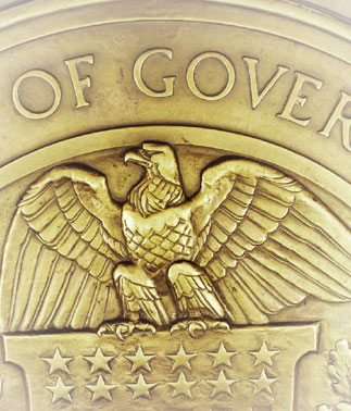
The Third Reich famously adopts this aesthetic of mass, exemplified by films such as The Triumph of the Will. The use of the German Eagle in their propaganda is one such powerful motif. But they are far from alone in using mass and associating it with state power. The Soviet examples are myriad. But this use is not limited to totalitarian states. Here is, for example a contemporary Federal Reserve eagle, and this one from Canada.
So the use of mass as a sign of permanence is part of the period aesthetics, and part of the dialog of light and thin against massive and monumental. Mass, implying the ability to extract and process large volumes of ore into steel, is a trope that had appeared in previous eras, with for example, gothic stylings in the Victorian, or Ming tombs and the Forbidden City. Mass is a way of a society demonstrating it's physical force and ability to project power through labor and capital. It is an idea that powered Stonehenge, the Inca cities, and the massive Egyptian pyramids.
The aesthetic of mass had many reasons to flower at that moment,in that form, and several of them can be associated with the results of that wave of capitalism: giganticism, materials, pollution, and mass urbanization, as well as the technologies of reproduction themselves, such as silk screening. Silkscreen creates areas of lighter or darker application naturally, and art works that use large blocs of color are often better recognizing the properties of the medium.
The 1930's adopts a palette of earth tones and sombre colors, which was coupled with the sense of darkness, despair, hard labor, but also massive industrialization. It was a period of large projects, precisely because labor and capital had become very cheap relative to the cost of money. In the United States, that produced the WPA, in Germany, the creation of a war machine. But the same aesthetic is at work: mass implying permanence, power, and purpose.
van Meegeren is hardly in the forefront of this aesthetic movement, or its use. From from being a generative force, by the time he adopts these tropes, they are already well established, and had been used in both high and commercial art for decades. Nor is his application of them particularly revelatory. His Vermeer-van Meegeren period is a mannered application of these forms.
Apocrypha
Apocrypha is the attribution of works created of whole cloth to another figure. Almost every important writer, artist, or creative person in history, from ancient philosophers forward, has works attributed to them. Some are not intended to be mistaken for the real thing, it is merely the way of that time and place. Others are clearly intended as forgery in that they are meant to be included among the works of the individual and expand the corpus. To be, as it were, the first among interpreters.
However some are even broader in intention: to be a rewriting of the meaning of the individual or the individuals actions. Apocrypha of this time are very different from forgeries, in that the forger is trying to create something that is very much alike the artist or figures output, only with their own ideas carried along with them. The creator of apocrypha is making a second creation: asserting their own equal genius, and in some way, erasing the figure that came before.
van Meegeren's work fits this description. It is art, where his pastiche was not. It is utterly different from Vermeer in almost every respect, fitting closely the aesthetics of his own time, in it's use of planes of color and abstraction, Gauguin and Cézanne derived techniques. He sits comfortably among contemporaries such as Diego Rivera, for example.
The creator of apocrypha, however, has two final twists to answer for, and these call into question the theories based on people merely fooling themselves about the nature of the works in question.
No comments:
Post a Comment